Sunday, June 03, 2012

Statistics With Gnuplot -- I. Correlation

At work I've been using gnuplot to do some function-fitting for me. In the course of that I came across a page on computing basic statistics with gnuplot, and it got me to thinking about how to apply this to something meaningful — you know, like baseball.

Note: I'm not an expert in statistics. I haven't ever taken a statistics course. If I get something wrong, please correct me gently. Thank you.

That said, it's been often remarked that On-Base percentage (OBP), Slugging Percentage (SLG), and their offspring, On Base Plus Slugging (OBP) are more highly correlated with runs scored than the traditional batting average (AVG). But how do we quantify that? With statistical analysis, of course.

We need data. I went to Major League Baseball's team statistics database and pulled off the AVG, OBP, SLG, OPS, and Runs/Game data from 1996 through 2011. That gave me data for 476 team/seasons, all playing 161, 162, or 163 games. That should be enough data for a start.

First let's look at the relationship between batting average and runs per game. We'll go through this on in reasonable detail. The data top of the datafile, which we'll call runs.dat, looks like this:

# AVG   OPB   SLG   OPS   RPG
 0.293 0.369 0.475 0.844 5.913
 0.288 0.360 0.436 0.796 5.377
 0.288 0.357 0.425 0.782 5.414
 0.287 0.355 0.472 0.827 5.932
 0.287 0.366 0.484 0.850 6.168
 0.284 0.358 0.469 0.827 5.693
 0.283 0.359 0.457 0.816 5.728
 0.281 0.360 0.447 0.807 5.543
 0.279 0.353 0.441 0.794 5.519

The full file is available on request.

Plot out runs per game versus average:

set title "Correlation of Runs with Batting Average"
set format x "%.3f"
set format y "%.1f"
set xlabel "AVG"
set ylabel "Runs/Game"
plot "runs.dat" using 1:5 notitle w p lt 1 pt 7 ps 1

which looks like this:

Correlation of Runs with batting average

OK. As we might expect, there is some correlation. Runs go up as the batting average improves. How much? We can use gnuplot's fitting routine to see. We'll assume a straight-line fit:

linear(start,slope,x) = start + slope*x
fit linear(avgstart,avgslope,x) "runs.dat" using 1:5 via avgstart,avgslope
set key left reverse Left
print avgstart, avgslope
replot avgstart + avgslope*x t "Linear Fit" w l lt 3 lw 2

Which produces a couple of numbers:

-5.07322075997934 37.0579378737095

and the plot

Correlation of Runs with batting average and linear fit

The slope of the line is 37.06, which tells us that a change in batting average from 0.260 to 0.270 will add another 0.37 runs per game to a teams scoring (on average). (Note that the fit misbehaves if we get a low batting average, predicting a negative number of runs. That's because this isn't a great model for baseball at all levels. We're only considering Major League Baseball, where most batters are able to at least make contact with major league pitching, and so can be expected to hit above 0.200 the Mendoza Line. Don't worry about that for now, we'll look for better fits later on in this series, if it should continue.)

How good is this fit? One way to quantify a fit is by the sample correlation coefficient, which in our case can be written as


R = <(x - <x>)(y - <y>)>/[σ(x) σ(y)] ,

Where x is the data on the x-coordinate of the plot (here AVG), y the data along the y-axis (here Runs/Game), and the brackets mean take the average. Careful authors don't call σ the standard deviation, but I will:

σ(x) = <(x - <x>)2>½ ~ .

The theory of R is simple. If R = 1, then all of the data in the last plot would fall on the line, and the line would slope upward. Then AVG and RPG would be perfectly correlated. On the other hand, if all the data fell on the line, but the line sloped downward, than R = -1, and AVG and RPG are prefectly anti-correlated. And if R = 0, there would be no correlation either way. So the closer |R| is to 1, the better AVG and RPG are correlated. (Standard disclaimers apply.) If R = 1 in the above plot we'd be able to perfectly predict how many runs a team would score if we just knew the team batting average. So what is R here?

To find R we'll need to find a lot of averages. Fortunately gnuplot is up to it. Suppose we wanted to fit the data in the last plot to a horizontal line. The formula for that is just f(x) = constant, and constant would just be the average value of the y (RPG) data. We can do the same thing with a vertical line for x. So to get the averages for AVG and RPG we write

fit linear(avgba,0.0,x) "runs.dat" using (1.0):1 via avgba
fit linear(avgrpg,0.0,x) "runs.dat" using (1.0):5 via avgrpg
print avgba, avgrpg

The (1.0) in the fit routine tells gnuplot that the x-variable is a constant equal to 1. Actually it's a dummy. We don't care what x is, but we have to tell gnuplot something. The :1 or :5 tell gnuplot to get the y axis data (the functional values) from the first or fifth columns.

Which gives us output:

0.264920168067234 4.74417436974786

We can judge the reasonableness of this with a little addition to the plot:

set arrow 1 from avgba,graph 0 to avgba,graph 1 nohead lt 2
set arrow 2 from 0.230,avgrpg to 0.300,avgrpg nohead lt 2
set label 1 "<AVG>" at avgba+0.001,graph 0.1 left
set label 2 "<RUN>" at 0.232,avgrpg+0.1 left
replot

(Using graph 0 on the x-coordinate has never worked for me in gnuplot.)

Which gives us a plot that looks like this:

Correlation of Runs with average averages.

The standard deviations work similarly, we're just averaging things in one dimension again:

fit linear (sigavg2,0.0,x) "runs.dat" using (1.0):(($1-avgba)**2) via sigavg2
sigavg = sqrt(sigavg2)
fit linear (sigrpg2,0.0,x) "runs.dat" using (1.0):(($5-avgrpg)**2) via sigrpg2
sigrpg = sqrt(sigrpg2)
print sigavg, sigrpg
set arrow 3 from avgba-sigavg,graph 0 to avgba-sigavg,graph 1 nohead lt 2
set arrow 4 from avgba+sigavg,graph 0 to avgba+sigavg,graph 1 nohead lt 2
set arrow 5 from 0.230,avgrpg-sigrpg to 0.300,avgrpg-sigrpg nohead lt 2
set arrow 6 from 0.230,avgrpg+sigrpg to 0.300,avgrpg+sigrpg nohead lt 2
set label 3 "<AVG>-SIGX" at avgba-sigavg-.001,graph 0.10 right
set label 4 "<AVG>+SIGX" at avgba+sigavg+.001,graph 0.10 left
set label 5 "<RUN>-SIGY" at 0.298,avgrpg-sigrpg+.1 right
set label 6 "<RUN>+SIGY" at 0.232,avgrpg+sigrpg+.1 left

The $1 and $5 in the above tell gnuplot you want to use the data from column 1 and column 5 in mathematical formulas. If we just used 1 or 5 here, gnuplot would interpret them as numbers.

All that done, here's a busy plot with the standard deviations marked off:

Correlation of Runs with standard deviation of AVG and RPG.

Finally, getting <(x - <x>)(y - <y>)> is a little trickier, since it's a fit to two variables. Fortunately, gnuplot can do that. The only trick is that we have to supply four parameters for a two-dimensional fit. The forth column is an error estimate, which we'll take to be one. Note that we have to also define a new functional.

avg2d(const,x,y) = const
fit avg2d(corxy,x,y) "./runs.dat" using (1.0):(1.0):(($1-avgba)*($5-avgrpg)):(1.0) via corxy
print corxy

Now we can compute the r factor, and print it onto the graph:

rfac = corxy/(sigavg*sigrpg)
print rfac
set label gprintf("R = %6.3f", rfac) at graph 0.9,graph 0.2 right

And here's the final plot, which shows that the correlation factor is 0.814. Good, but not perfect:

Correlation of Runs showing R = 0.814.

Here's the entire script in one place, just to make it easier for me to cut and paste, and to annotate it:

set title "Correlation of Runs with Batting Average"
set format x "%.3f"
set format y "%.1f"
set xlabel "AVG"
set ylabel "Runs/Game"
# AVG in column 1, Run/Game in column 5
plot "runs.dat" using 1:5 notitle w p lt 1 pt 7 ps 1
# Our basic linear function
linear(start,slope,x) = start + slope*x
# Find the best linear relationship between AVG and RPG
fit linear(avgstart,avgslope,x) "runs.dat" using 1:5 via avgstart,avgslope
set key left reverse Left
# Plot the fit
replot avgstart + avgslope*x t "Linear Fit" w l lt 3 lw 2
# Get average of batting averages
fit linear(avgba,0.0,x) "runs.dat" using (1.0):1 via avgba
# Get average of runs per game
fit linear(avgrpg,0.0,x) "runs.dat" using (1.0):5 via avgrpg
# Plot some arrows
set arrow 1 from avgba,graph 0 to avgba,graph 1 nohead lt 2
set arrow 2 from 0.230,avgrpg to 0.300,avgrpg nohead lt 2
# And labels
set label 1 "<AVG>" at avgba+0.001,graph 0.1 left
set label 2 "<RUN>" at 0.232,avgrpg+0.1 left
# Now get the standard deviations of AVG and RPG:
fit linear (sigavg2,0.0,x) "runs.dat" using (1.0):(($1-avgba)**2) via sigavg2
sigavg = sqrt(sigavg2)
fit linear (sigrpg2,0.0,x) "runs.dat" using (1.0):(($5-avgrpg)**2) via sigrpg2
sigrpg = sqrt(sigrpg2)
# More arrows:
set arrow 3 from avgba-sigavg,graph 0 to avgba-sigavg,graph 1 nohead lt 2
set arrow 4 from avgba+sigavg,graph 0 to avgba+sigavg,graph 1 nohead lt 2
set arrow 5 from 0.230,avgrpg-sigrpg to 0.300,avgrpg-sigrpg nohead lt 2
set arrow 6 from 0.230,avgrpg+sigrpg to 0.300,avgrpg+sigrpg nohead lt 2
# And labels:
set label 3 "<AVG>-SIGX" at avgba-sigavg-.001,graph 0.10 right
set label 4 "<AVG>+SIGX" at avgba+sigavg+.001,graph 0.10 left
set label 5 "<RUN>-SIGY" at 0.298,avgrpg-sigrpg+.1 right
set label 6 "<RUN>+SIGY" at 0.232,avgrpg+sigrpg+.1 left
# Finally, find the correlation coefficient.  Note the 4-component
#  call to the fit routine.
avg2d(const,x,y) = const
fit avg2d(corxy,x,y) "./runs.dat" using (1.0):(1.0):(($1-avgba)*($5-avgrpg)):(1.0) via corxy
rfac = corxy/(sigavg*sigrpg)
set label gprintf("R = %6.3f", rfac) at graph 0.9,graph 0.2 right
# And print out the numbers for posterity:
print avgstart, avgslope
print avgba, avgrpg
print sigavg, sigrpg
print corxy
print rfac
replot

And now for the heart of the matter. Let's use the same procedure to look at the correlation between On-Base Percentage and Runs:

On-Base Percentage versus Runs/Game

R = 0.903, somewhat higher than the AVG/RPG correlation.

How about pure slugging:

Slugging Percentage versus Runs/Game

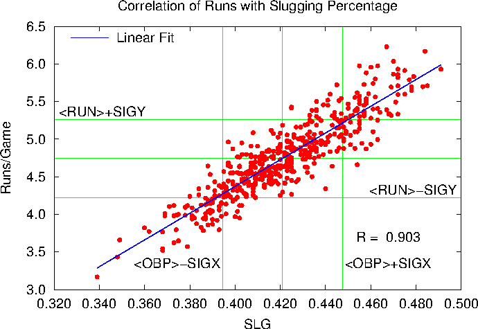
Here R = 0.9026, where above R = 0.9031. OBS and SLG correlate equally well with Runs per game.

So what about everybody's favorite one-number way to evaluate a player?

On-Base Plus Slugging (OPS) versus Runs/Game

Here R = 0.952. So our conclusion is that OPS is very well coordinated with Runs scored per game. Better than OBP or SLG, and far better than the batting average.

Now we could do all of this with fancy statistical packages, but for simple stuff like this we can do it all with gnuplot and see everything graphically.

Now that's the story for a very simple set of statistics. What about something like Runs Created? Is it really correlated with Runs per Game? Next time …

Saturday, August 06, 2011

Can I Go Home Now?

We've all been there. The home team drops seven runs in an early inning. By the seventh inning stretch they've shown no sign of an offense, and are still six runs down. It's hot, muggy, Washington night, there are thunderstorms brewing over the horizon, and your wife just phoned that she heard on WTOP that Rt. 50 to Annapolis was closing for repair work at 10 p.m.

Question: If I go home now, am I likely to miss anything? Aside from heat stroke and road rage?

Answer: Probably not. If the visiting team is ahead by six runs after the top of the seventh, historically the chance that the home team will pull out a victory is 1.6%, or about 60 to 1 against. Unless you're of the extreme optimist persuasion I'd suggest going home.

I got to thinking about this a few years ago, when Bill James published an article in Slate on when a college basketball game is really over. Based on his observations, he was able to come up with an algorithm which predicts when a team has a safe lead, based on the lead, time left in the game, and who has the ball.

In baseball we can do the same kind of thing, except that there are only a finite number of logical stopping points (the end of a half-inning) and leads (the largest of which was less than 30 runs). Plus, we have a line score for just about every major league baseball game played since 1900, so we have a lot of data. This means that we don't need no stinkin' algorithm, we can give you the history probability that any given lead was overcome.

I didn't go all the way back to 1900. I stopped at 1948, because that was the data that was available using Retrosheet's Play-by-Play Files. With the Chadwick Software Tools we can go through all the games in the database and see how many times that, say, the visiting team was ahead by five runs after then end of the first, and how often the home won in that situation. Do that for all possible combinations of leads and innings and we get the table below. (You may have to widen your browser window to see everything.)

Visitors Lead Tie Home Lead
Inn. 10+ 9 8 7 6 5 4 3 2 1 0 1 2 3 4 5 6 7 8 9 10+
T 1 .077 .000 .040 .041 .083 .157 .187 .304 .378 .486 .591                    
B 1 .000 .000 .063 .056 .055 .132 .148 .236 .313 .416 .533 .643 .740 .819 .893 .912 .933 .960 1.00 .944 1.00
T 2 .000 .027 .067 .057 .080 .169 .180 .262 .345 .452 .580 .692 .781 .846 .925 .929 .969 .974 1.00 .941 1.00
B 2 .000 .016 .043 .032 .055 .134 .127 .218 .295 .397 .532 .656 .756 .829 .895 .920 .956 .966 .957 .976 1.00
T 3 .034 .032 .019 .043 .075 .133 .166 .250 .339 .456 .582 .705 .801 .863 .927 .939 .972 .984 .980 1.00 1.00
B 3 .015 .024 .016 .031 .047 .095 .122 .200 .278 .394 .526 .655 .766 .840 .909 .930 .958 .977 .986 .989 .990
T 4 .012 .021 .028 .033 .071 .096 .145 .225 .314 .446 .589 .719 .820 .886 .933 .963 .971 .988 .990 .994 .988
B 4 .004 .011 .022 .028 .039 .062 .094 .164 .252 .369 .526 .677 .788 .866 .917 .949 .969 .986 .990 .992 .996
T 5 .004 .009 .020 .031 .045 .078 .114 .199 .290 .422 .591 .741 .843 .904 .945 .967 .982 .995 .995 .991 1.00
B 5 .002 .005 .009 .019 .026 .049 .077 .139 .224 .344 .523 .692 .808 .887 .936 .962 .981 .989 .995 .993 .999
T 6 .001 .005 .011 .019 .031 .055 .091 .161 .268 .406 .600 .771 .873 .931 .964 .975 .994 .995 .999 .998 .998
B 6 .001 .000 .005 .009 .014 .030 .049 .097 .185 .305 .520 .725 .848 .917 .956 .972 .989 .994 .998 .999 .998
T 7 .001 .001 .004 .010 .016 .038 .061 .118 .217 .357 .610 .819 .912 .958 .977 .991 .995 .998 .999 1.00 .999
B 7 .000 .002 .002 .002 .007 .015 .033 .059 .130 .245 .523 .772 .894 .949 .973 .990 .995 .998 .999 .999 .999
T 8 .000 .001 .003 .004 .007 .017 .041 .074 .153 .296 .634 .890 .956 .985 .992 .997 .999 1.00 .999 1.00 1.00
B 8 .000 .000 .000 .001 .002 .006 .013 .027 .067 .150 .519 .865 .944 .981 .990 .997 .999 1.00 .999 1.00 1.00
T 9+ .000 .000 .000 .002 .003 .007 .014 .033 .071 .157 .615 1.00 1.00 1.00 1.00 1.00 1.00 1.00 1.00 1.00 1.00
B 9+ .000 .000 .000 .000 .000 .000 .000 .000 .000 .000 .524 1.00 1.00 1.00 1.00            

So what is all of this?

  • The left hand column represents the situation at the end of either the top (visitor's) half of an inning, or the bottom (home team's) half, so T 7 describes the situation just before the Cubs let that day's designated karaoke singer ruin Take Me Out to the Ballgame. Since all innings after the ninth are played under the same conditions — the team ahead after the bottom of the inning wins, and if it's tied we try, try again — I combined all the data from those games into the labels T 9+ and B 9+.
  • The other columns represent the lead by either the home team (on the right) or the visiting team (left) at the end of the half-inning. Ties are right in the middle.
  • The decimal fraction in each block indicates the home team's chance of winning in that situation. So, for example, if you've just sat through an agonizing top of the third, when Yankees have scored a bunch of runs and lead by 7, we look at row T 3, column Visitors 7, and see that the Orioles have a 0.043 (4.3%) chance of winning the game — no, that's not true. Over the course of the last 60 years, 4.3% of all major league home teams down by 7 going in to the bottom of the third have come back to win. These are the Orioles, however, so they have about a 0.001% chance of coming back.
  • I put all leads of ten or more runs in the 10 + categories. The software I wrote to write the table is easy to modify to list bigger leads, if you like.. I stopped at 10 because that will more or less fit on a standard blog page.
  • The blank spaces are impossible situations. The home team can't score before it gets up to bat, so the right-hand side of the T 1 row can never be reached. And the home team doesn't need the bottom of the ninth or later inning unless it was tied or behind after the top of the inning. In that case they can never win the game by more than four runs.
  • Indeed, I debated about putting in the B 9+ column, since it's a trivial case, but I wanted to highlight the fact that the home team still has a big advantage if the score is tied in late or extra innings. I've discussed this elsewhere.
  • Finally, I haven't told you about the statistical significance of these results, i.e, the standard deviation or the sample size. Suffice it to say that there are more than enough events here for leads of nine runs or less. When we get to the 10+ category, especially in the early innings, there just aren't that many games. If you want to see the raw numbers (home wins/visitor wins/total games) drop me a line and I'll send them to you.
  • Really last finally: I made a slight modification to the Chadwick source code to make it easier to parse the runs scored per inning. I also wrote a Perl script and some Fortran code to parse the output from Chadwick and write the HTML for the table above. If you're interested in the codes, drop me a line. If there's enough interest I'll make all the code available on my website.

Monday, July 11, 2011

Baseball After the All Star Break

Some years ago, I did a predictive study on how Major League Baseball teams would rank at the end of the season, based on their records at the All Star Break and the Pythagorean projection of future wins, based on the runs scored and allowed by each team.

It didn't work all that well. In particular, I predicted that Boston would win the AL East pennant, and Washington would be the NL Wild Card. That sorta didn't happen.

Nevertheless, I'll try again. Here's the table, based on the MLB standings at the All Star Break. The method is the same as last time, so you can read all about it there.

American League
East  W   L  PCT Place GB  RS   RA  Pyth GL PW PL TW TL PCT GB
New York Yankees 53 35 0.602 2 1 455 334 0.637 74 47.14 26.86 100.14 61.86 0.618 0.00
Boston 55 35 0.611 1 0 482 371 0.617 72 44.42 27.58 99.42 62.58 0.614 0.73
Tampa Bay 49 41 0.544 3 6 380 343 0.546 72 39.35 32.65 88.35 73.65 0.545 11.80
Toronto 45 47 0.489 4 11 426 416 0.511 70 35.76 34.24 80.76 81.24 0.498 19.39
Baltimore 36 52 0.409 5 18 355 454 0.390 74 28.85 45.15 64.85 97.15 0.400 35.29
Central  W   L  PCT Place GB  RS   RA  Pyth GL PW PL TW TL PCT GB
Cleveland 47 42 0.528 2 0.5 386 382 0.505 73 36.85 36.15 83.85 78.15 0.518 0.00
Detroit 49 43 0.533 1 0 413 421 0.491 70 34.39 35.61 83.39 78.61 0.515 0.46
Chicago White Sox 44 48 0.478 3 5 366 383 0.479 70 33.55 36.45 77.55 84.45 0.479 6.29
Minnesota 41 48 0.461 4 6.5 347 414 0.420 73 30.69 42.31 71.69 90.31 0.443 12.16
Kansas City 37 54 0.407 5 11.5 402 449 0.450 71 31.94 39.06 68.94 93.06 0.426 14.91
West  W   L  PCT Place GB  RS   RA  Pyth GL PW PL TW TL PCT GB
Texas 51 41 0.554 1 0 457 404 0.556 70 38.91 31.09 89.91 72.09 0.555 0.00
Los Angeles Angels 50 42 0.543 2 1 355 330 0.533 70 37.32 32.68 87.32 74.68 0.539 2.59
Seattle 43 48 0.473 3 7.5 301 319 0.474 71 33.63 37.37 76.63 85.37 0.473 13.28
Oakland 39 53 0.424 4 12 315 339 0.467 70 32.66 37.34 71.66 90.34 0.442 18.24
National League
East  W   L  PCT Place GB  RS   RA  Pyth GL PW PL TW TL PCT GB
Philadelphia 57 34 0.626 1 0 384 295 0.618 71 43.86 27.14 100.86 61.14 0.623 0.00
Atlanta 54 38 0.587 2 3.5 365 312 0.571 70 39.96 30.04 93.96 68.04 0.580 6.89
New York Mets 46 45 0.505 3 11 399 388 0.513 71 36.40 34.60 82.40 79.60 0.509 18.46
Washington 46 46 0.500 4 11.5 352 354 0.497 70 34.82 35.18 80.82 81.18 0.499 20.04
Florida 43 48 0.473 5 14 352 396 0.447 71 31.71 39.29 74.71 87.29 0.461 26.15
Central  W   L  PCT Place GB  RS   RA  Pyth GL PW PL TW TL PCT GB
St. Louis 49 43 0.533 2 0 433 407 0.528 70 36.97 33.03 85.97 76.03 0.531 0.00
Milwaukee 49 43 0.533 1 0 405 406 0.499 70 34.92 35.08 83.92 78.08 0.518 2.05
Pittsburgh 47 43 0.522 3 1 354 346 0.510 72 36.75 35.25 83.75 78.25 0.517 2.22
Cincinnati 45 47 0.489 4 4 437 408 0.531 70 37.18 32.82 82.18 79.82 0.507 3.79
Chicago Cubs 37 55 0.402 5 12 375 459 0.409 70 28.63 41.37 65.63 96.37 0.405 20.34
Houston 30 62 0.326 6 19 358 464 0.384 70 26.89 43.11 56.89 105.11 0.351 29.08
West  W   L  PCT Place GB  RS   RA  Pyth GL PW PL TW TL PCT GB
San Francisco 52 40 0.565 1 0 332 322 0.514 70 35.97 34.03 87.97 74.03 0.543 0.00
Arizona 49 43 0.533 2 3 416 407 0.510 70 35.70 34.30 84.70 77.30 0.523 3.28
Colorado 43 48 0.473 3 8.5 395 407 0.486 71 34.53 36.47 77.53 84.47 0.479 10.44
Los Angeles Dodgers 41 51 0.446 4 11 340 373 0.458 70 32.06 37.94 73.06 88.94 0.451 14.92
San Diego 40 52 0.435 5 12 304 338 0.452 70 31.63 38.37 71.63 90.37 0.442 16.34

Abbreviations:

  • W: Current team wins
  • L: Current team loses
  • PCT: Winning rate
  • Place: Current place in standings
  • GB: Games Behind
  • RS: Total Runs scored by team
  • RA: Total Runs allowed by team
  • Pyth: Pythagorean expected win rate. Following MLB, I used an exponent of 1.82 rather than the original James value of 2. It doesn't make a lot of difference, and didn't change the order.
  • GL: Games left in season for the team
  • PW: Projected wins in remainder of season, assuming they win at the Pythagorean rate
  • PL: Projected Pythagorean loses
  • TW: Total wins, current + projected Pythagorean
  • TL: Total loses
  • PCT: Projected final winning ratio
  • GB: Projected final games behind

OK, not a lot of changes going on. Despite an anemic offense, San Francisco's fantastic pitching will keep them in first in the NL West. Philadelphia will win the NL East going away, even though Atlanta wins the NL Wild Card. Texas will hang on in the AL West.

There are a few predicted swaps, highlighted in yellow: St. Louis will pull ahead of Milwaukee. And Cleveland will (yawn) edge out Detroit. Surprisingly, the only changes occur at the top, which probably says something about competitive balance in MLB.

And, finally, Red Sox will be the AL Wild Card. Which means …

Frak

Saturday, July 02, 2011

The Home Team Wins Most Ties (In Baseball, Anyway)

I've been playing around with Retrosheet to see how often a baseball team wins a game if it's, say, five runs ahead at the end of the fourth inning. I plan to get that up sometime during this long weekend, but while doing the study I found another interesting result.

Retrosheet's Play-by-Play files, along with the cwevent program from Chadwick, let you extract all sorts of information from almost every MLB game played between 1950-2010. From that data I extracted every game that was tied at the end of a half-inning, and figured out who eventually won. Then I counted up the number of times the home team won for each half-inning. The results are shown below:

Probability Home Team wins baseball game if it is tied at the end of a half-inning

Click on graph to see a larger figure

The black diamond represents the situation at the start of the game, the red diamonds the situation where the game is tied in the middle of the inning, and the blue diamonds when it's tied at the end of an inning. We'll get to the error bars in a minute.

So what is all of this? Well, at the beginning of a game the score is obviously tied, so that should be part of the study. So if we look at all 115,748 games in the database, we find:

  • The Home Team won 62,418 games,
  • the Visiting Team won 53,192 games, and
  • there were 138 games that were tied when the game was called.

If we throw out the ties, then the Home Team won 53.990% of the games that went to a decision. That's the black diamond at the far left of the graph. The 54% win rate is baseball's version of Home Field Advantage, and it has been very constant:

Probability Home Team wins baseball game in a given year

Click on graph to see a larger figure

I performed the same calculation for all the games which were tied at the end of a half inning. For example, if the game is tied at the end of the fifth, the home team has a 52.0% chance of eventually winning the game. Tied after the top of the sixth? It's up to 60%.

So what do the error bars represent? Basically they give you an idea of the number of games in the sample. Suppose that in a given game the home team wins with probability p. Then in an N game sample the probability that the home team wins n games follows the binomial distribution, e.g.

             N!        n      N-n
P(N,n) = -----------  p  (1-p)
          n! (N-n)!

If we look at a large number of N-game samples, then we'll find that on average the home team will win N p games, which makes sense. The standard deviation will be [N p (1-p)]½. Since the graph normalized everything by the number of games played, the error bars are the standard deviation divided by N, or [p (1-p)/N]½. Since most values of p are between 0.5 and 0.7, wider error bars basically tell you that fewer games have gotten to that point. And when the error bars get really wide, as they do after the fourteenth inning or so, it says there aren't enough statistics available to give you meaningful information.

What does it all mean, you ask? Well, first it says that the home team advantage is real. Why there is a home field advantage is another question, and there is not enough information here to answer that question.

Then there's the observation that the home team has a larger advantage if the game is tied in the middle of the inning than it does if the game is tied at the end of an inning. That's just common sense. In the middle of the fourth inning, the visiting team has five more innings at the plate. The home team has six — five for sure, and one more if they need it. This isn't the home team bats last advantage, it's the home team gets one more at-bat than the visitors advantage, not the same thing.

Next, we see that if the game is tied at the end of an inning, the home team's advantage decreases slightly, so that at the end of eight innings it's only 51.94%. Presumably that's because the home team does have some advantage in being at home, but as the game progresses they have less and less chance to use that advantage. After the fifth inning the home team's advantage oscillates around 52%, down from the 54% advantage they had at the start of the game.

Indeed, the fact that the blue dots go down from innings 1-4 suggests that the home team bats last advantage isn't worth a whole lot. If it was, you'd expect the advantage to be greater in tie-game situations as the game wears on, because that last at-bat becomes a larger and larger proportion of what's left of the game.

Finally, there is that dip in the red diamonds between the first and second inning. If the game is tied going into the bottom of the first, meaning that the visiting team didn't score, then the home team will win 59.15% of the time, with a standard deviation of 0.17%. If the game is tied going into the bottom of the second, however, then the home team only has a 58.01% chance of winning, with σ = 0.22%. That's a five-σ change in the probability, which I would think is statistically significant. The win rate is pretty much constant in the third inning ( 58.16% ± 0.27%) and then starts going up, as you'd expect, since the home team has proportionately more at-bats than the visitors at the middle of an inning.

Why is this so? I have no idea. All I can say is that if your a visiting baseball team, it's better to be tied with the home team in the middle of the second inning than it is to be tied before the home team comes to bat. And you better be ahead by the middle of the third.

The information used here was obtained free of charge from and is copyrighted by Retrosheet. Interested parties may contact Retrosheet at www.retrosheet.org.

Sunday, June 12, 2011

An Update on the Average Major League Hitter

This is the promised update to my table of pretty good averages for everyday baseball players at the major league level. As before, I consider an everyday ball player to be one who was eligible for a league batting title in a given year, which from 1996-2010 means that he made at least 502 plate appearances in a given year.

The raw data for this study was taken from the mySQL database thoughtfully provided by the folks at Baseball-DataBank.org. As outlined in yesterday's post, I used mySQL to pull out the appropriate data, this time using the command:

select b.yearID as Year, m.nameLast as Last, m.nameFirst as First,
b.teamID as TEAM, b.G, b.AB+b.BB+b.HBP+b.SH+b.SF as PA, b.AB, b.R, b.H, b.2B,
b.3B, b.HR, b.RBI, b.SB, b.CS, b.BB, b.SO, b.IBB, b.HBP, b.SH, b.SF, b.GIDP
from Batting b inner join Master m
where b.playerID=m.playerID and b.yearID>1995 and
b.AB+b.BB+b.HBP+b.SH+b.SF > 502
order by b.yearID ASC, m.nameLast, m.nameFirst;

to get a list of all players from 1996 on who were eligible for a batting title. I then used mysql-query-browser to export all of the data into a spreadsheet, and there computed all of the averages and standard deviations. All the calculations are the same as in my original post, except:

  • I added the batting data for the 2009 and 2010 seasons.
  • My original post fraked up David Smyth's Base Runs statistic. I used the right formula (the second one on the page), but miscalculated total bases by forgetting that doubles, triples, and home runs are already counted as hits. So the numbers found in my earlier study are too high.
  • I dropped 1995 from the study this time because only 144 games were scheduled for each team, so the batting eligibility criterion was 144 × 3.1 = 447 plate appearances. Just lazy.

Saturday, June 11, 2011

Take Me Out to the SQualL Game

As some of you know, I have a moderate interest in Baseball and Baseball statistics. However, I'm not a database programmer, and the little bit of DB manipulation I've looked at has left me hopelessly confused.

Several years ago I did buy a copy of Baseball Hacks, but I never really got started with it. Last weekend I had some time on my hands and started playing around with it. Turns out you actually have to try to do something with a program in order to learn it (who'da thunk?). And it also turns out the Baseball Hacks, even though it's an O'Reilly book, is pretty oriented to Windows/Microsoft Access, although it does have substantial hints for Linux and Mac users, not to mention an online collection of scripts from the book (ZIP file), along with some other stuff.

So what should we do? As a first shot, how about updating my table of averages for several modern baseball statistics to include 2009 and 2010? I did the previous tables by doing some judicious editing of the Batting.csv file in Sean Lahman's baseball database, but the folks at Baseball-Databank.org have all of the data packaged neatly into a mySQL database (ZIP file), so we'll use that.

So as a start, we're going to

  • Install appropriate parts of the mySQL database program in Ubuntu,
  • Set it up to read the database file,
  • Find the eligible batters for 2009 and 2010,
  • Get their batting data into a spreadsheet,
  • Find the appropriate averages, runs created, etc., and
  • add the results to the appropriate tables.

That should be enough for one day. It's going to be a long journey, though, so when you've got some time join us after the break.

Saturday, April 10, 2010

Rubbing It In

Before every game in the Major Leagues, workers unwrap 100-200 brand-new, shiny baseballs, each bearing Bud Selig's signature.

You won't believe what they do to them.

Thursday, October 15, 2009

Doubly Bad Seasons

At the end of this season, the Washington Nationals finished as the worst team in baseball, with a record of 59-103 (0.364). To add insult to injury, the Baltimore Orioles finished as the worst team in the American League, 64-98 (0.395). So if you had the misfortune to watch all the Orioles and Nationals games on MASN, you saw a combined record of 123-201 (0.380).

This set me to wondering how bad this really is. In most two-team markets, when one team is up, the other one is down, right? Well, not always. I went looking through the season standings in Retrosheet, searching for two teams in the same market that finished at the bottom of the division.

Saturday, October 10, 2009

A Pretty Good Average

June 12, 2011: This post completely fraks up the calculation of David Smyth's Base Runs statistic. I've now fixed that, and added the data from 2009 and 2010. You can find all the updated tables here.

I'm a big fan of Sabermetrics, the use of statistical information to understand how baseball teams win games. Part of this is my love for the game, part my natural tilt toward numerical data, and part is that I've always enjoyed reading Bill James's work (full disclosure: he and I overlapped at KU, though we never met). Not to mention the fact that, from my desk, I can see several editions of both The Baseball Encyclopedia and Total Baseball.

But … in the old days, we judged batters by average (> 0.300 is good), home runs (> 30), and runs batted in (> 100). That was it. These stats have some problems: batting average doesn't tell you how many times a guy gets on base by walking, you can only bat in runs when your teammates are already on base, and as for home runs — well, OK, home runs are a pretty fair way to determine part of a players value.

The inadequacy of the traditional trio of AVG/HR/RBI led to the development of new measures for player performance: On-base percentage, slugging average, runs created, etc., etc. The problem is that off the top of my head I don't know what's a good number for any of these statistics. OK, a slugging percentage of 0.900 is better than 0.400, but is a player who slugs 0.500 a power hitter, or just Joe Shlabotnik?

Saturday, May 16, 2009

The Back of the Ticket

From the back of the Washington Nationals Baseball ticket for May 15, 2009. Footnotes added.

By the use of this ticket, the ticket holder agrees that: (a) he or she shall not transmit or aid in transmitting any information about the game or related activities to which it grants admission,a including, but not limited to,b any account,c description, picture,d video,e audio,f reproductiong or other information concerning the game or related activitiesh (the Game Information); (b) the Club issuing the ticket is the exclusive owner of all copyrights and other proprietary rights in the game, related activities,i and Game Information; and (c) the participating Clubs, Major League Baseball Properties, Inc., Major League Baseball Enterprises, Inc., MLB Advanced Media, L.P. and each of their respective affiliates, licensees and agents shall have the perpetualj and unrestricted right and license to use his or her name,k image, likenessl and/or voicem in any broadcast, telecast, photograph, video and/or sound recordingn taken in connection with the game for all purposes and in all mediao known and unknownp throughout the universe.q Breach of any of the above will automatically terminate this license and may result in further legal action.r

aSo if you sneak into the game, you can do any of these things?

bDon't worry, we'll think of other things later

cWhich is why I can't actually tell you about the game

dNo snapping pictures with your cell phone

eRemember Sonny ripping the film from the camera? Applies here, too.

fThe cell phone conversation, where you called your wife to tell her the game was going into extra innings? Verboten

gEven with sock puppets

hSuch as the young woman bouncing up and down three rows in front of you

iThis includes all bubble gum, sunflower seed shells, and tobacco wads spit out by players during the game

jOne of the five people you meet in heaven will be an MLB Lawyer. Oh wait, if there's a lawyer there …

krcjhawk will now forever be associated with the Washington National Baseball Club

lWell, I don't suppose they'll be using my likeness, but that woman three rows down …

mI have been told that I have a voice made for blogging.

nWait! We left out Leroy Neiman pantings!!!

oWhew. For a moment I'd thought we'd left a loophole.

pJust in case sending pictures via DNA encoding ever becomes popular

qAt least on Arcturus they don't complain about us calling our championship the World Series

rA century from now, if we find you put a picture of this game in a scrapbook, we'll exhume your body, drag it to the site of the Spanking-Brand-New Washington Nationals of Boise Park, and cast it out through the front gate. Then we'll sue your heirs.

Friday, May 15, 2009

The World's Best Visual Illusions

Well, I'm not sure they're the best, but here are some really neat visual illusions, including why a curve ball appears to make a sudden break as it reaches the plate, when we know it's really making a smooth curve.

Wednesday, February 11, 2009

Just in Case You Are Still Naive Enough to Believe Your Secrets are Safe

Rodriguez, A., On the propensity for unfavorable information to leak even though they tell you that it will absolutely, positively, be destroyed, ESPN (2009).

Wednesday, April 02, 2008

The First Night

Of course, I got tickets to the official opening game at Nationals Park, watching the Braves play the Nationals on Sunday.

Those of you outside the DC area might not know that they built the park with very little parking. As a 20-game ticket holder, I could have gotten a parking pass for $20-$35 per game, but it's a difficult part of town to get in and out of, so I decided to use one of the other two options: Metro, or the National's unique shuttle service, where you park (for free) in a lot at old RFK Stadium, and then take a shuttle bus to the new park, all for free. Must cost the Lerners a bundle. Tonight, I decided to take the shuttle, which winds out of RFK, onto the Southeast-Southwest Freeway (I295/395), past the Marine Barracks, and dumps you about three blocks from the stadium. All in all it went pretty smoothly, but this was a Sunday night. How things will work during rush hour is anyone's guess.

Since I had tickets up (way up) above first base, when I got to the park

First View of Nationals Park

I headed for the first base entrance, where I found a rather long line:

The Line Outside Nationals Park

The problem, of course, was that Dubya was present, so we all had to go through metal detectors. That's fine, except the first base side only had four. After an hour or so, someone from the Nationals finally got a clue, and told us that in right center field there were twenty (count 'em, 20) gates, and small lines. Gee, thanks guys. There were dozens of Nats employees hanging around, saying “gee, look at the long lines” for an hour or more, and they finally say something at about 7:50, for an 8pm start.

I eventually got in, and up the the main concourse in time for the National Anthem

The Opening Ceremonies

and, thanks to the wonders of TV commercials, up to my seat (second row from the top, though our regular seats will be much closer to the field) in time for the first pitch

Just after first pitch at Nationals Park

Odalis Perez to Kelly Johnson, for a strike.

The Nats scored twice in the first inning, then made 24 straight outs before Ryan Zimmerman ended it with a walk-off homer with two out in the bottom of the ninth. During the game, I took a bit of a walk-about, and got this picture of the Anacostia waterfront, which looks a lot better at night than it does in the day.

Anacostia Waterfront from top of Nationals Park

All in all, the park looks to be a pretty good place to see a ball game. The main question is whether or not 40,000 people can get to it during a DC rush hour, or out of it after a day game. But as a place to watch baseball, it looks like it's going to be a winner.

Tuesday, December 11, 2007

Simpler, Gentler Times

It's often thought that in the past people were nicer to each other. In particular, people didn't use “four letter Anglo-Saxon words.”

This turns out not to be the case, at least among baseball players.

Note: if watching shows on BBC America offends you, then you don't want to click on this link.

Note2: Otherwise, be sure to click on the images of the original document.

Friday, October 19, 2007

Best Thing He's Ever Done

Sunday, August 19, 2007

AL Central, 18 August 2007

When your team is out of the cellar in August for the first time in four years, it's time to celebrate:

Team W L Streak Pct. GB
Cleveland68 54 W3 .557
Detroit67 56 L2 .545 1 ½
Minnestota61 61 L1 .500 7
Kansas City55 67 W3 .451 13
Chicago54 68 L7 .443 14

Since 2004, the KC number in the “GB” column has usually been in the 30's, so being only 13 games back is a considerable improvement.

Saturday, April 14, 2007

THE Record Book

Every year, for decades, the people at The Sporting News has been putting out an annual Baseball Record Book. I have several of them on my shelf. Want to know how many no-hitters have been pitched? It's there. Record number of home runs hit by a second baseman? It's there. Want to see the famous Maris asterisk? Well, it wasn't ever there, but the older books did say that the home run record for a 154 game season was 60, by someone named Ruth, and Maris hit 61 in a 162 game season, until Mark McGwire erased both in 1998.

Used to be you had to pay for all of this, updated yearly. No more. This year, it's free. That's right, SN lets you download eleven PDF files that make up the whole book. If you want, you can print them out and take them to a binder, but you can also just view them on your screen, and they're searchable using xpdf, evince, kpdf, or even Adobe Acrobat Reader.

The Sporting News 2007 Complete Baseball Record Book

If this doesn't satisfy your baseball jones, then you need to join SABR.

Saturday, January 13, 2007

Public Service Announcement

Friday, March 10, 2006

All the Scores You Need

If you have satellite or digital cable, you undoubtedly get ESPNEWS, all sports news, all the time. Just in case the scores don't come at you fast enough, at the bottom of the screen is the ESPN BottomLine, which scrolls through all sorts of events, giving scores, playing times, and, for those of us who don't gamble, a few highlight bullets.

Just in time for the Final Four, I found that you can get ESPN BottomLine on your computer. True, you can get it from ESPN. However, for Firefox and Mozilla users, there's the ESPN BottomLine Extension, which puts the Bottom Line on, well, the bottom of your browser. Not only do you get the scores, but you can scroll through the previous bullets, and when you click on a title you get more of the story from ESPN's web site. It's updated constantly, so you can follow next week's NCAA tournament from your desk without having a big banner that your boss might see.

The only problem I've had so far is that sometimes the thing wants to take over my whole browser, then you have to restart, basically, since it wipes out all of the navigation bars. But it's definitely a nice extension to have when sports events are taking place while you're at work, e.g. the tournament and, starting next month, baseball.

Oh, you can enable/disable this by looking in Firefox's View menu and clicking on "ESPN BottomLine."

Monday, July 11, 2005

Yankees Lose!!!
The, THE, THE
Yankees Lose!!
*

It's the All Star break, which makes it a good time to take stock of the season so far. Here are the standings after Sunday night's games:

2005 American League Standings
 
EAST W L PCT GB RS RA
Boston 49 38 0.56322 0.0 473 429
Baltimore 47 40 0.54023 2.0 431 409
NY Yankees 46 40 0.53488 2.5 478 431
Toronto 44 44 0.50000 5.5 428 381
Tampa Bay 28 61 0.31461 22.0 399 553
 
CENTRAL W L PCT GB RS RA
Chicago Sox 57 29 0.66279 0.0 413 339
Minnesota 48 38 0.55814 9.0 396 360
Cleveland 47 41 0.53409 11.0 406 365
Detroit 42 44 0.48837 15.0 387 375
Kansas City 30 57 0.34483 27.5 376 485
 
WEST W L PCT GB RS RA
LA Angels 52 36 0.59091 0.0 420 355
Texas 46 40 0.53488 5.0 476 430
Oakland 44 43 0.50575 7.5 400 386
Seattle 39 48 0.44828 12.5 377 388
 
2005 National League Standings
EAST W L PCT GB RS RA
Washington 52 36 0.59091 0.0 357 361
Atlanta 50 39 0.56180 2.5 428 348
Florida 44 42 0.51163 7.0 383 368
Philadelphia 45 44 0.50562 7.5 410 417
NY Mets 44 44 0.50000 8.0 387 381
 
CENTRAL W L PCT GB RS RA
St. Louis 56 32 0.63636 0.0 447 340
Houston 44 43 0.50575 11.5 365 362
Chicago Cubs 43 44 0.49425 12.5 394 394
Milwaukee 42 46 0.47727 14.0 392 374
Pittsburgh 39 48 0.44828 16.5 365 403
Cincinnati 35 53 0.39773 21.0 434 518
 
WEST W L PCT GB RS RA
San Diego 48 41 0.53933 0.0 406 385
Arizona 43 47 0.47778 5.5 394 479
LA Dodgers 40 48 0.45455 7.5 384 422
San Francisco 37 50 0.42529 10.0 393 457
Colorado 31 56 0.35632 16.0 389 493

In the above table, "RS" and "RA" stand for "Runs Scored" and "Runs Allowed," respectively. More on that later.

From the standings, we see that there isn't any contest in either the AL or NL Central divisions, that the AL and NL West are, if not wrapped up, at least uninteresting for the moment, and that the most exciting baseball is being played in the AL East, closely followed by the NL East, where the Nationals are surprisingly in first place.

And "if the playoffs started tomorrow" we'd have Minnesota and Atlanta as the Wild Cards, and the Yankees would be out of the playoffs. (Yankees delenda est!)

Now one of the rules of baseball is that to win you have to score more runs than your opponent. If we look at the above table, you'll note that the Washington Nationals, though in first place in the NL East, have been outscored 361-357, even though they are 16 games over 0.500. What this means is that the Nationals are winning close games (except this last week) and losing blowouts. This is Not a Good Thing for Nats fans, because the winner of a one-run game is determined mostly by luck.

This is quantified by what is known as the the Pythagorean Method, which in its simplest form says that the fraction of games a team should win is related to RS and RA by the formula:

Pct. = RA2 /(RA2 + RS2)

So what would the Pythagorean rule say about this season? Let's calculate how the standings would look if each team won and lost according the to above equation:

2005 American League Standings
EAST RS RA PW PL Pct. PGB
Toronto 428 381 49.0953 38.9047 0.55790 0.0000
NY Yankees 478 431 47.4348 38.5652 0.55157 0.6605
Boston 473 429 47.7338 39.2662 0.54866 0.8615
Baltimore 431 409 45.7770 41.2230 0.52617 2.8183
Tampa Bay 399 553 30.4701 58.5299 0.34236 19.1252
 
CENTRAL RS RA PW PL Pct. PGB
Chicago Sox 413 339 51.3816 34.6184 0.59746 0.0000
Cleveland 406 365 48.6664 39.3336 0.55303 3.7152
Minnesota 396 360 47.0860 38.9140 0.54751 4.2956
Detroit 387 375 44.3540 41.6460 0.51574 7.0276
Kansas City 376 485 32.6598 54.3402 0.37540 19.2218
 
WEST RS RA PW PL Pct. PGB
LA Angels 420 355 51.3291 36.6709 0.58329 0.0000
Texas 476 430 47.3552 38.6448 0.55064 2.9739
Oakland 400 386 45.0491 41.9509 0.51781 5.7800
Seattle 377 388 42.2493 44.7507 0.48562 8.5798
 
2005 National League Standings
EAST RS RA PW PL Pct. PGB
Atlanta 428 348 53.5788 35.4212 0.60201 0.0000
Florida 383 368 44.7170 41.2830 0.51997 7.3617
NY Mets 387 381 44.6875 43.3125 0.50781 8.3913
Washington 357 361 43.5098 44.4902 0.49443 9.5690
Philadelphia 410 417 43.7467 45.2533 0.49154 9.8320
 
CENTRAL RS RA PW PL Pct. PGB
St. Louis 447 340 55.7473 32.2527 0.63349 0.0000
Milwaukee 392 374 46.0667 41.9333 0.52349 9.6805
Houston 365 362 43.8590 43.1410 0.50413 11.3883
Chicago Cubs 394 394 43.5000 43.5000 0.50000 11.7473
Pittsburgh 365 403 39.2058 47.7942 0.45064 16.0414
Cincinnati 434 518 36.2953 51.7047 0.41245 19.4520
 
WEST RS RA PW PL Pct. PGB
San Diego 406 385 46.8612 42.1388 0.52653 0.0000
LA Dodgers 384 422 39.8603 48.1397 0.45296 6.5008
San Francisco 393 457 36.9863 50.0137 0.42513 8.8748
Arizona 394 479 36.3194 53.6806 0.40355 11.0418
Colorado 389 493 33.3822 53.6178 0.38370 12.4790

Here "PW" and "PL" are the wins and losses as predicted by they Pythagorean rule, and yes, I've kept way to many decimal places. (You'll note that the total number of wins in this table isn't equal to the total number of losses. That's because the Pythagorean rule is applied on a per-team basis, so a win for one team isn't necessarily a loss for another team.)

For the Central and Western divisions of both leagues these results are essentially the same as the actual records. In the Easts, however, things are drastically different. For one thing, Toronto is actually a very good ballclub, ten games above 0.500. The Yankees aren't doing as badly as Mr. Steinbrenner thinks, they're in contention for the Wild Card. And in the NL, Atlanta is in its accustomed place, and Washington is at about 0.500.

Of course, what this tells us is that the Pythagorean rule isn't exact, and will have some discrepancies, especially over only a portion of a season. But it does suggest that the Nationals have been playing over their heads, as anyone who watched the games with the Mets and the Phillies will attest, and that the AL East is going to be very interesting.

OK, now for the fun part: Let's assume that for the rest of the year teams will win at their current Pythagorean rate, but, of course, keep the wins they already have. Then we get the following standings:

2005 American League Standings
EAST W L Pct. GB
Boston 90.1499 71.8501 0.55648 0.0000
NY Yankees 87.9191 74.0809 0.54271 2.2307
Baltimore 86.4629 75.5371 0.53372 3.6869
Toronto 85.2847 76.7153 0.52645 4.8652
Tampa Bay 52.9923 109.0077 0.32711 37.1575
 
CENTRAL W L Pct. GB
Chicago Sox 102.4070 59.5930 0.63214 0.0000
Minnesota 89.6109 72.3891 0.55315 12.7961
Cleveland 87.9241 74.0759 0.54274 14.4829
Detroit 81.1966 80.8034 0.50121 21.2104
Kansas City 58.1550 103.8450 0.35898 44.2520
 
WEST W L Pct. GB
LA Angels 95.1631 66.8369 0.58743 0.0000
Texas 87.8488 74.1512 0.54228 7.3143
Oakland 82.8355 79.1645 0.51133 12.3276
Seattle 75.4218 86.5782 0.46557 19.7413
 
2005 National League Standings
EAST W L Pct. GB
Atlanta 93.9466 68.0534 0.57992 0.0000
Washington 88.5878 73.4122 0.54684 5.3589
Florida 83.5174 78.4826 0.51554 10.4293
NY Mets 81.5781 80.4219 0.50357 12.3685
Philadelphia 80.8821 81.1179 0.49927 13.0645
 
CENTRAL W L Pct. GB
St. Louis 102.8784 59.1216 0.63505 0.0000
Houston 81.8095 80.1905 0.50500 21.0689
Milwaukee 80.7379 81.2621 0.49838 22.1404
Chicago Cubs 80.5000 81.5000 0.49691 22.3784
Pittsburgh 72.7981 89.2019 0.44937 30.0803
Cincinnati 65.5210 96.4790 0.40445 37.3574
 
WEST W L Pct. GB
San Diego 86.4367 75.5633 0.53356 0.0000
LA Dodgers 73.5189 88.4811 0.45382 12.9178
Arizona 72.0555 89.9445 0.44479 14.3812
San Francisco 68.8848 93.1152 0.42521 17.5519
Colorado 59.7777 102.2223 0.36900 26.6590

Based on these predictions, Atlanta will keep its accustomed first place in the NL East, Washington is a good shot for the Wild Card, just because they've won so many games in the first half of the season. And Boston and Minnesota will hold one to the AL East and the Wild Card to (yeah!) keep the Yankees out of the postseason.

Of course, these projections are just that, projections, and aren't a guarantee of anything. Don't even think about using these to place bets. At the end of the season we'll see how well these predictions stack up.


* I could not love baseball so much, did I not hate the Yankees more.